Reference Brand: Miles International Property
This card uses the blue logo of our reference brand. Clean placement, spacing and visual restraint help establish premium trust from the first screen.
This page showcases the live project we delivered for Miles International Property. It is not a moodboard; it is a real production output covering brand, content and conversion execution.
This card uses the blue logo of our reference brand. Clean placement, spacing and visual restraint help establish premium trust from the first screen.
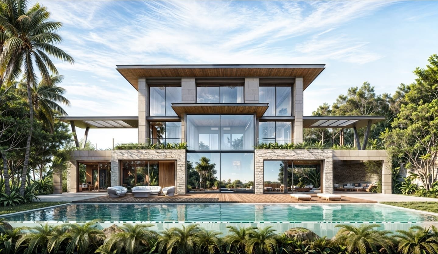
For the Miles project, we used large visual blocks, concise headlines and clear CTA direction. The result is a cleaner path from listing exploration to contact action.
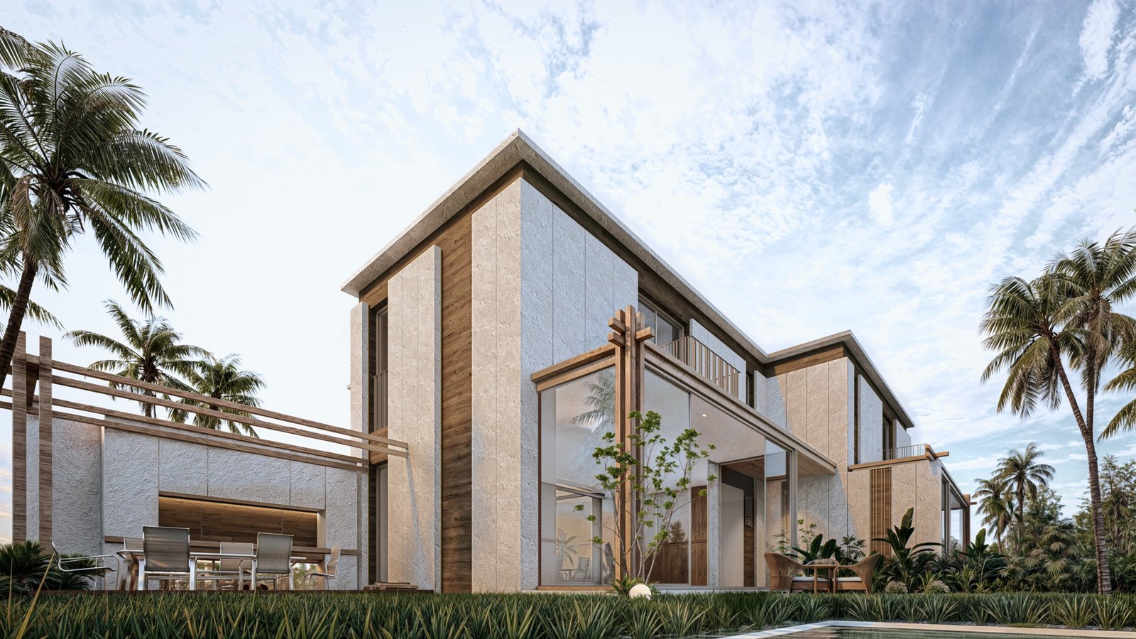
In this project, image choice, spacing and presentation tone were aligned to create a more coherent trust signal between the team and the company identity.
Live client project:
milesinternationalproperty.com
For Miles, our goal was to increase premium perception while accelerating contact intent. We delivered a clear sales path that turns high-intent visitors into qualified conversations.
Request Similar Execution for My Brand